Themes
APIScope uses the same Scope ecosystem theme tokens as EntityScope. Switch themes from the palette icon in the main panel toolbar — your choice is saved in .apiscope/config.json and restored when you reopen the workspace.
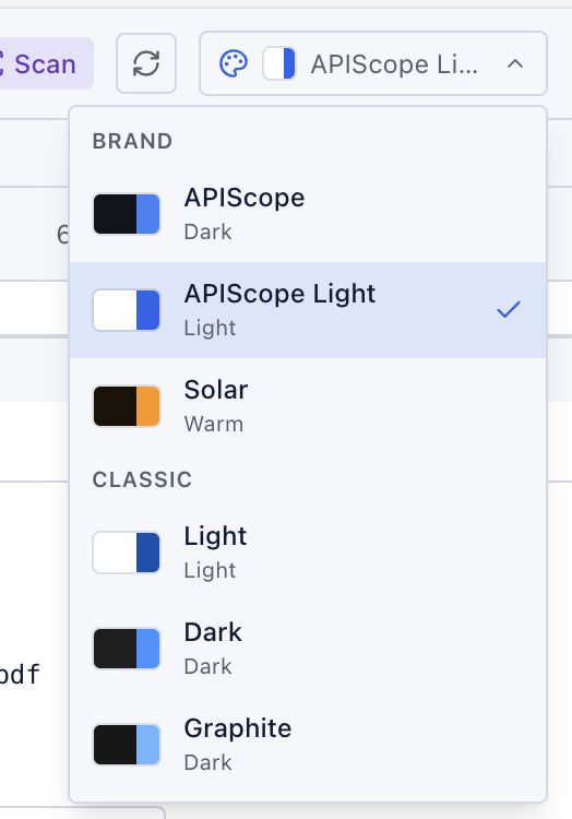
Brand themes
APIScope-branded palettes tuned for the product UI:
| Theme | Hint | Background | Accent |
|---|---|---|---|
| APIScope | Dark | Navy #0f1419 | Blue #3b82f6 |
| APIScope Light | Light | White #ffffff | Blue #2563eb |
| Solar | Warm | Deep brown #1a1208 | Orange #ff9500 |
APIScope Light is the default when VS Code / Cursor is set to a light color theme. APIScope (dark) is the default for dark editor themes.
Classic themes
Editor-inspired palettes for users who prefer a more neutral look:
| Theme | Hint | Background | Accent |
|---|---|---|---|
| Light | Light | White #ffffff | Navy #0550ae |
| Dark | Dark | Charcoal #1e1e1e | Blue #3794ff |
| Graphite | Dark | Near-black #181818 | Sky blue #6cb6ff |
Editor theme sync
On first open, APIScope follows your editor color theme:
| VS Code / Cursor theme | APIScope default |
|---|---|
| Light | APIScope Light |
| Dark | APIScope |
| High Contrast | Graphite |
Once you pick a theme manually from the palette menu, APIScope keeps your choice in config.json (ui.theme) until you change it again — it no longer auto-syncs with the editor theme.
Theme tokens
All themes share the same semantic token names (--as-bg, --as-accent, --as-tree-selected, etc.) defined in webview-ui/src/styles/themes.css. UI components reference tokens, not hardcoded colors, so every theme stays consistent across collections, the request editor, and the response viewer.
Tips
- Use Solar for long sessions — the warm palette reduces eye strain on dark backgrounds.
- Use APIScope Light or Light when capturing documentation screenshots in light mode.
- Graphite maps to VS Code High Contrast mode automatically if you have not set a theme manually.